

Advice and answers from the Advanced Web Ranking Team
Search for articles
>
>
How to Build SEO Reports That Prove Value: The Advanced Web Ranking and Data Studio Connector Playbook
Build executive, client, and SEO team dashboards in Data Studio with four ready-to-use AWR report templates.

The Advanced Web Ranking (AWR) connector for Data Studio pushes your rank-tracking data (visibility scores, ranking positions, estimated traffic, SERP feature presence such as AI Overviews, search intent, competitive market share, etc.) straight into live, auto-refreshing dashboards. This guide explains what comes after you've connected AWR to Data Studio: how to turn that data into reports your clients, team, or leadership actually understand.
What this article covers
The eight AWR data sources available through the connector and what each is built for, from Visibility and Ranking to Market Share, Keyword Gap, Keyword Difficulty, and the SERP Features Evolution in Time source.
What today's SEO reports need to contain, mapped to three audiences (executives, clients, and SEO teams) so you avoid dashboard bloat.
Four build-ready report templates, each framed by a real reporting use case and mapped to the AWR data source that powers it:
The Executive Visibility Pulse, powered by Visibility Evolution In Time
The Monthly Client Scorecard, powered by Visibility Date Comparison
The SEO Team Ranking Workbench, powered by Keyword Ranking Date Comparison
The Share of Voice & Competitor Tracker, powered by Market Share Evolution In Time
Rankings are the raw input. Visibility and estimated traffic turn that input into a story. Business outcomes are what makes someone actually care. Every template below follows that same path, from data to meaning to impact.
Why ranking data still anchors the modern SEO report
Reporting has changed more in the last two years than in the previous ten. Generative engines now sit on top of the SERP, clients ask whether they appear in AI Overviews, and stakeholders want the connection between search work and revenue spelled out in plain language. But underneath all of it, one thing hasn't changed: search visibility is still the leading indicator of a website's performance. Rankings move first, while traffic, conversions, and revenue follow.
The problem most teams hit isn't a shortage of data, it's an excess of it. Google Search Console, GA4, and rank trackers between them produce hundreds of metrics. Without a framework for which numbers matter, at what reporting frequency, and for whom, a dashboard becomes noise. And the research on this is pretty consistent: dashboards that stick to a handful of well-chosen metrics get used, while the ones trying to show everything tend to get ignored.
A quick note on naming. Google rebranded Google Data Studio to Looker Studio in 2022, then reversed that decision in April 2026, restoring the Data Studio name. You may still come across the Looker Studio name, but it refers to the same product.
The eight AWR data sources, and the job each one does
When you create an AWR data source in Data Studio, you pick a report type.
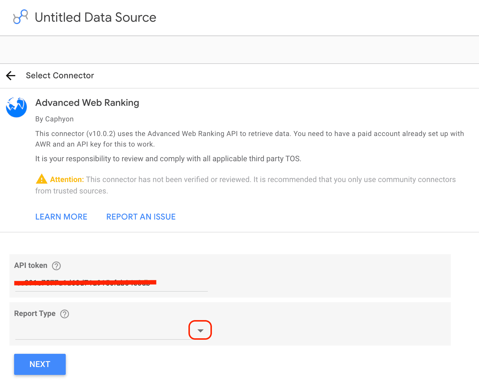
Each report type is a purpose-built data source with its own metrics and dimensions.
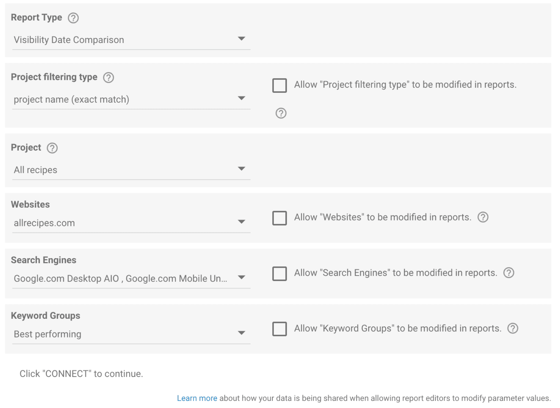
Choosing the right one is the most important decision in your build, because it determines which questions your report can answer. Here's the map.
Data source(report type) | What it answers | Best for |
Visibility Evolution In Time | "How has our overall search presence trended?" | Executive trend dashboards, MoM/QoQ narratives |
Visibility Date Comparison | "What changed between two dates, and by how much?" | Monthly client scorecards, period-over-period reviews |
Keyword Ranking Date Comparison | "Which keywords, URLs, and SERP features moved?" | SEO team diagnostics, search intent analysis |
Keyword Ranking Evolution In Time | "How did individual keyword/URL positions trend day by day?" | Keyword and landing-page-level deep dives |
Market Share Evolution In Time | "How do we stack up against competitors over time?" | Share of voice, competitive intelligence, pitch decks |
Keyword Gap | "Where are the ranking opportunities against specific competitors?" | Prioritization, content gap analysis |
Keyword Difficulty | "Which keywords are realistically winnable?" | Opportunity sizing, content planning |
SERP Features Evolution in Time | "How is SERP feature presence changing over time?" | AI Overviews tracking, SERP feature trend reporting |
This guide builds a dedicated template around four of these sources: Visibility Evolution In Time, Visibility Date Comparison, Keyword Ranking Date Comparison, and Market Share Evolution In Time. Keyword Ranking Evolution In Time doesn't get its own template here, but shows up inside Template 3 as the companion view for day-by-day tracking. The rest, Keyword Gap, Keyword Difficulty, and SERP Features Evolution in Time, are covered near the end of this article.
Every template below uses a hand-picked set of fields from its data source, not the full list. Each of the eight data sources exposes far more dimensions, metrics, and parameters than what you'll see in the builds ahead. What's included here is what our team deemed most useful for that audience and use case, not a ceiling on what the source can do.
Configuration steps, project filtering, search engine and keyword group selection, and everything else you'll set when connecting a source, live in the Data Studio Data Source Setup guide. Keep it open while you build.
For the complete list of AWR metrics available for each Data Studio report type, see:
Know your audience before you start building
The fastest way to build a report nobody reads is to build one report for everybody. Executives, clients, and SEO teams each need a different metric budget and reporting schedule, and mixing the three into one dashboard is how you end up with something nobody actually opens twice.
Executives are looking for a fast read they can scan once a month and move on. What matters to them isn't how rankings are broken down by device or search engine, it's whether search presence is growing and what that growth is worth. That's why the Search Visibility Score leads the view here, with Estimated Visits right below it translating that visibility into a number leadership instinctively understands: projected traffic.
Clients read more closely and want more context. Delivered monthly with a quarterly deep-dive, their scorecard works best arranged into a handful of clear categories rather than a long unsorted list, and every number needs a comparison attached. "Visibility percent: 64.2%" tells a client almost nothing on its own. "64.2%, ▲ 5.5% vs last month" tells them something happened. Pair every headline number with its trend arrow and a short note on what moved it.
SEO teams need depth, not polish: as many metrics as the work requires, refreshed weekly or even daily, down to keyword and URL level. This is the operational workbench where the team finds top movers, SERP feature wins, and AI Overviews capture, and decides what to fix next.
Designing each template against one of these profiles keeps the layout focused. Every template below names its primary audience up front, and shows a real build, not a hypothetical spec.
Template 1 - The Executive Visibility Pulse
Powered by: Visibility Evolution In Time report type
Primary audience: Executives, leadership, account directors
Reporting frequency : Monthly
The question it answers: "Is our search presence growing, and what is it worth?"
This is the report you put in front of someone who has thirty seconds. Nine scorecards are grouped into three clear categories: Search Visibility & Traffic (Search Visibility Score, Click share, Estimated visits), Position (First place, On first page, Average rank), and Gain & Loss (Moved up, Net gain, Net loss). Each one carries its month-over-month delta so the direction of travel is unambiguous at a glance. Below the scorecards sits a single hero chart: Visibility percent over time, one line per tracked website.
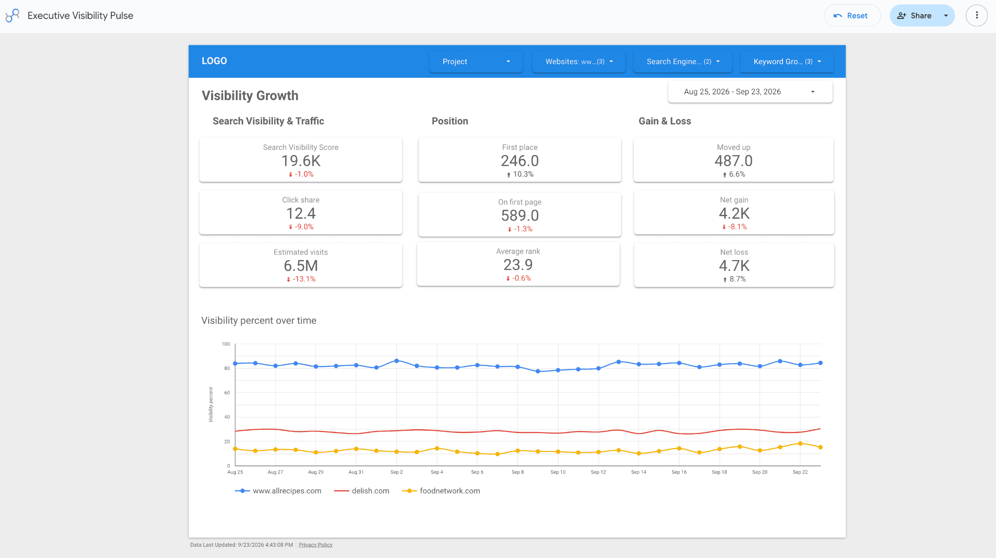
Since the Visibility Evolution In Time data source can merge data from multiple projects, this template can double as a portfolio dashboard for agencies and in-house teams managing several brands or markets. The Project filter already sits in the header alongside Websites, Search Engine, and Keyword Group, so switching between accounts or rolling several into one view takes a click, not a rebuild.
Why these metrics: grouping into three labeled categories, rather than one long row of numbers, is what keeps the nine scorecards readable at a glance. The eye scans by category, not by individual number.
Now possible: AI Overviews trend. Earlier builds of this template couldn't add an AI Overviews presence trend without crowding the layout, because it meant pulling from the keyword-level ranking source into a report designed to stay high-level. With the SERP Features Evolution in Time data source, you can now add a standalone AI Overviews occurrence chart, filtered to that one feature, without touching your ranking table or your keyword data source at all.
For the period-over-period framing that pairs naturally with this template, see MoM visibility and ranking reporting with Data Studio.
Click to view the Executive Visibility Pulse template, and once it opens, use the ⋮ menu in the top right and select Make a copy to get your own editable version.
Template 2 - The Monthly Client Scorecard
 Powered by: Visibility Date Comparison report type
 Primary audience: Clients, retainer stakeholders
 Reporting frequency: Monthly, with quarterly deep-dive
 The question it answers: "What changed this period, and is the work paying off?"
The Visibility Date Comparison data source works differently from Template 1's Evolution In Time: it's built to contrast two AWR update dates and surface the delta on every metric, which is precisely what a client wants to see. The layout leads with twelve scorecards in three grouped blocks: Search Visibility & Traffic (Visibility percent, Average rank, Click share, Estimated visits), Ranking Distribution (First place, Top 3, On first page, Below first page), and Gain & Loss (Net gain, Net loss, Moved up, Moved down). Each one carries its percentage change against the previous date.
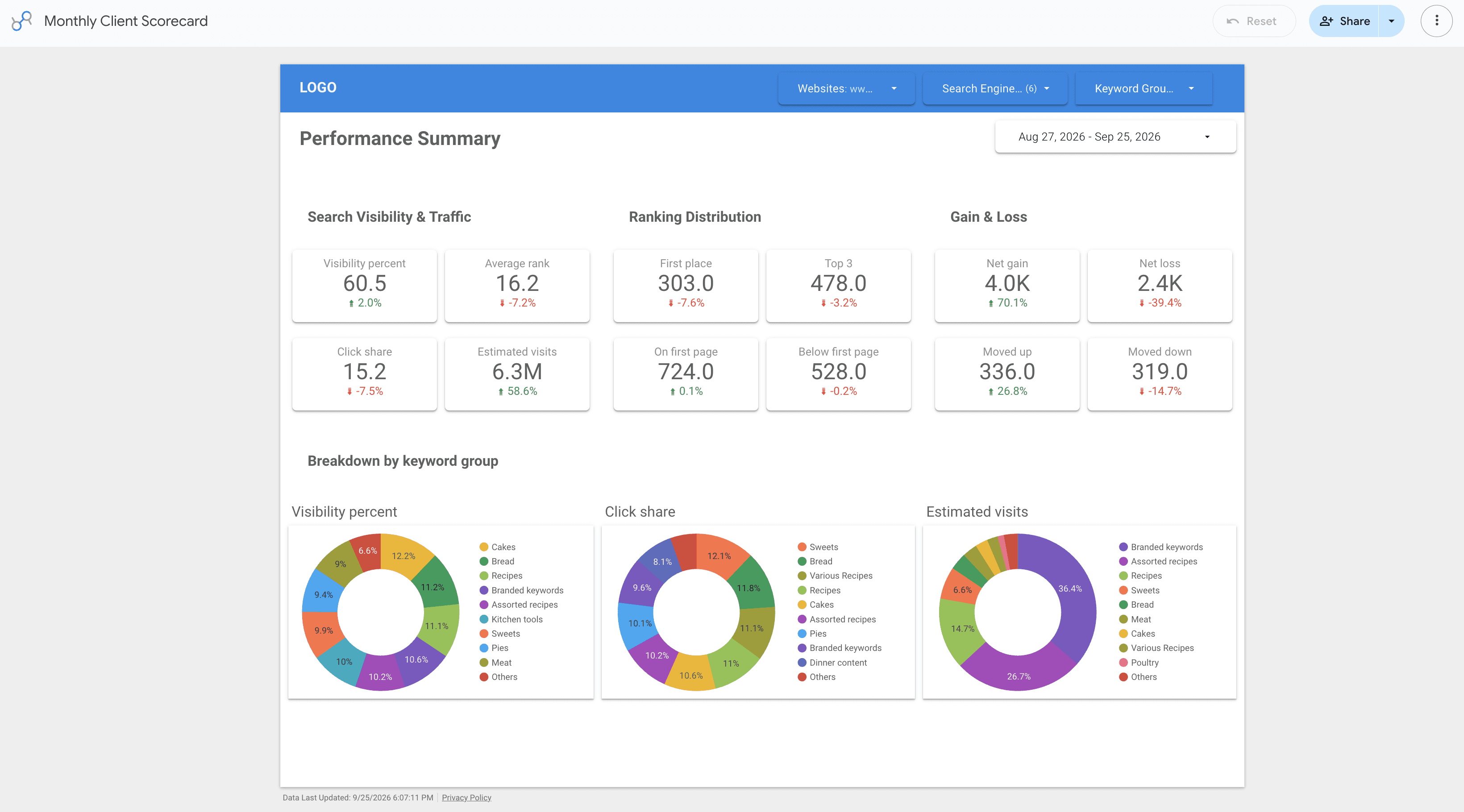
Below the scorecards, a Breakdown by keyword group section turns abstract visibility into recognizable business segments. The same keyword groups appear in three donut charts, each one sliced by a different metric: Visibility percent on the left, Click share in the middle, Estimated visits on the right.
For this client, those groups are built around recipe types (cakes, bread, sweets, and so on), with branded keywords tracked as their own slice alongside them. This segmentation ties visibility numbers to categories the client already thinks in, not just abstract search metrics they have to translate themselves. Keeping branded keywords visible as its own category, rather than folding it into the rest, is one of the cleanest ways to separate SEO's contribution from existing brand demand.
Why this works for clients: every number has a comparison built in, and the keyword-group breakdown gives you natural talking points for the monthly call. Add a short text box at the top for a plain-language summary of what changed, why, and what's next, and you've turned a dashboard into a report.
Click to view the Monthly Client Scorecard template, and once it opens, use the ⋮ menu in the top right and select Make a copy to get your own editable version.
Template 3 - The SEO Team Ranking Workbench
 Powered by: Keyword Ranking Date Comparison report type
 Primary audience: SEO practitioners, content and technical teams
 Reporting frequency: Weekly (operational)
 The question it answers: "Which keywords, URLs, and SERP features moved, and where's the opportunity?"
Of all four templates, this one goes deepest. The Keyword Ranking Date Comparison source is the richest in the connector: keyword-level Position, Search Volume, Competition, CPC, the ranking URL, the SERP feature the URL appeared as, and Search Intent (current, previous, secondary, and previous secondary). It's the only source that lets you build a true diagnostic workbench. Websites, Keyword Groups, and Search Engines all sit as filters in the header, so the same layout works whether you're looking at one site or several.

The layout is built in three bands:
Top scorecards. Ranked Keywords, Organic, AI Overviews, Blended, and Search demand, each with its period delta, comparing two AWR updates. The AI Overviews scorecard is the one your competitors using GSC-only dashboards simply cannot produce.
SERP feature distribution. Horizontal bar charts (Desktop / Mobile) showing the count of keywords by result type: organic, reviews, recipes, AI Overviews, videos, and more. This is your at-a-glance map of how you're winning, not just whether.
Keyword detail, the workbench. Keyword, URL, Search engine, SERP, Position, and Search volume, sortable and filterable. This is where the team finds the work: high-volume keywords ranking just below the fold, AI Overviews appearances to defend, intent mismatches to fix.
Two fields worth pulling into that table even though they're not in the base build above, because they're exactly what this data source is built to answer:
AI Overviews, tracked like any other SERP feature. The SERP column already shows you which keywords trigger AI Overviews versus other result types, but you can go further: since AWR captures AI Overviews as a tracked result type inside this same ranking data source, you can add a dedicated filter or breakdown for it, count AIO appearances, see which URLs earn them, and trend that count period over period, using the same chart types you'd use for any other feature. In a market where most tools treat AI visibility as a bolt-on, this is native to the ranking data itself. (Note: this is rank-tracking SERP-feature data, distinct from any separate AI brand-monitoring product.)
Search Intent, one field you'll want to add. The data source includes Search Intent, Previous Search Intent, Secondary Search Intent, and Previous Secondary Search Intent, none of which are in the table above by default. Add the Search Intent column and you can answer questions a position report alone can't: Are we ranking for the right kind of query? Did an intent shift, visible via Previous Search Intent, explain a ranking drop? Should this informational keyword point at a different URL? Background on how AWR classifies intent lives in the search intent detection algorithm documentation.
Click to view the SEO Team Ranking Workbench template, and once you open it , use the ⋮ menu in the top right and select Make a copy to get your own editable version.
Template 4 - The Share of Voice & Competitor Tracker
Powered by: Market Share Evolution In Time report type
Primary audience: Strategy leads, clients in competitive verticals, new-business pitches
Reporting frequency: Monthly or quarterly
The question it answers: "How do we stack up against our competitors, and is the gap closing?"
Visibility tells you how you're doing on your own. Market Share tells you how you're doing relative to your business field, which is often the more persuasive story, especially in pitch decks and board reviews. Four scorecards lead the page - Market share, Click share, Estimated visits, and Keywords Top 20, each with its period delta, followed by a Share of Voice over Time chart: market share percent, one line per competitor, so the competitive trajectory is the first thing the reader sees. Search Engine and Keyword Group sit as filters in the header; there's no Websites filter to configure, since the data source pulls in every ranking domain automatically.
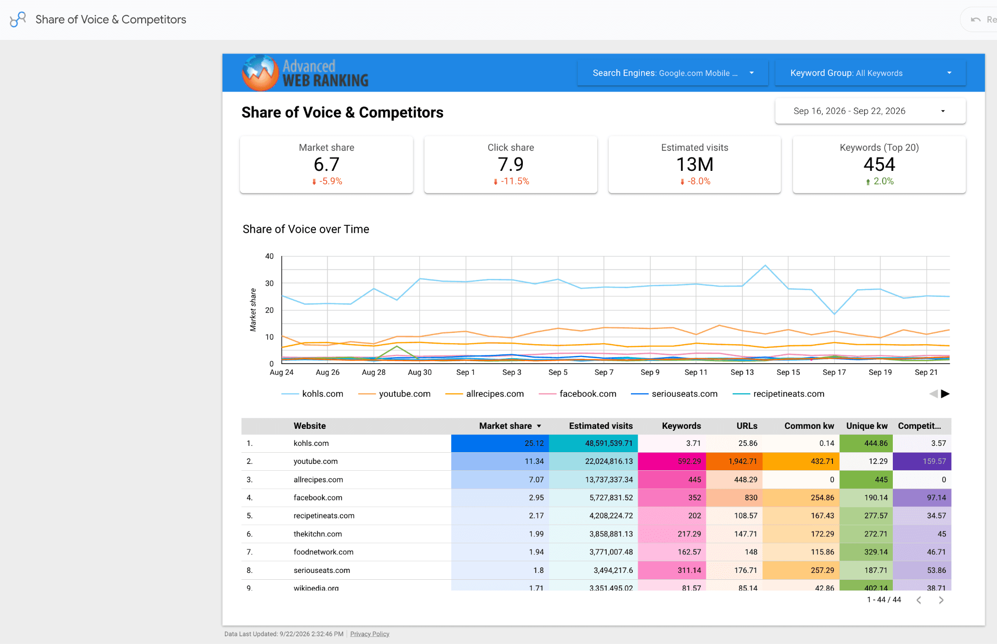
Beneath the chart, a competitive matrix table lays out every tracked domain's Market share, Estimated visits, Keywords, URLs, Common keywords, Unique keywords, and Competitor unique keywords, sorted by market share. The "Unique keywords" and "Competitor unique kw" columns are pure opportunity. They're the gap analysis your content team can act on immediately.
Setup note: remember that Market Share data sources take one search engine and one keyword group at a time. To make those switchable in the report, enable the relevant filters during data source setup, otherwise you'll be rebuilding the source every time you want a different cut. See the setup guide for the exact toggle.
Open the Share of Voice & Competitor Tracker template, and use the ⋮ menu in the top right and select Make a copy to get your own editable version.
Design principles for good AWR-powered dashboards
A few rules that apply whether you're using the templates above as-is, editing them, or building your own report from scratch:
Put the outcome first. The top-left corner is what people actually look at, so that's where important metrics such as the Estimated Visits or Market share belongs, not buried under a wall of ranking data. Rankings still matter, they just make more sense as supporting detail once the reader already knows the headline.
Attach a comparison to data you show. A number on its own doesn't tell anyone if things are going well. Use the Date Comparison sources so a trend arrow shows up next to each metric automatically, instead of counting on someone to remember what last month looked like.
When a dashboard starts feeling crowded, group instead of cutting. Nine scorecards in one flat row look like a lot. The same nine, split into three labeled categories, read in a few seconds. Most of the time the problem isn't too many numbers, it's no structure to hold them.
Use labels your audience already understands. "Visibility percent" means something to you and nothing to a client, so add a short note on scorecards to provide context on the number.
Size the report to the audience, not to a rule of thumb. The executive pulse stays at nine scorecards and one chart because that's what a thirty-second read allows. The client scorecard runs to twelve because clients want the extra context. The team workbench goes as deep as the diagnostic work needs. If a metric doesn't change a decision for that audience, leave it out.
Keep charts and tables apart. Charts work for the high-level story that executives and clients need. Tables are for the line-by-line digging teams. Put both on the same page and you may end up with something too dense to skim and too shallow to dig into.
Replace the placeholder branding before sharing the report. Swap the LOGO block, match colors to the client's palette, and keep the header bar consistent. It's a small thing, but an unbranded report reads as a draft, not a deliverable.
The connector's real advantage: one pipeline for everything you build
Once you've copied the four templates above into your own Data Studio account, they don't have to stay as four separate builds you maintain manually. Put them as pages inside a single report if you want one link that covers everyone, one date range picker, one place to update the logo. Keep them standalone if the client only ever sees their own scorecard and the exec team never needs to see the keyword-level workbench. Either way, all four pull from the selected AWR projects and refresh automatically, so nobody needs to export a CSV or update a screenshot before a meeting.
If you want to go beyond these four templates, the connector also exposes Keyword Gap, Keyword Difficulty, and SERP Features Evolution in Time data sources. Keyword Gap and Keyword Difficulty tell you which keywords are worth going after next; SERP Features Evolution in Time tells you how the SERP itself is shifting over time, AI Overviews included.
Ready to build? Start with Data Source Setup, pick the report type that matches your audience from the table above, and reference the matching metrics and dimensions article as you map your fields.
Frequently Asked Questions
Which AWR data source should I use for a client report?
Can I report on AI Overviews through the Data Studio connector?
Can I combine multiple projects into one Data Studio report?
How many metrics should a report actually contain?
Looker Studio or Data Studio, what's the difference?
stay in the loop