
For many people, reporting is a time-consuming, manual, and incredibly inefficient SEO task.
On top of being slow to make, they can also be tedious and at the bottom of the list for the reasons why you’ve decided to do SEO as a career.
Cue the SEO reporting dashboard!
SEO dashboards are great because they provide instant and up-to-date insight into how well your search campaign is going. For your clients, reporting dashboards are incredibly useful because they can automate the reporting process, saving you valuable time to focus on what you do best, SEO.
Nearly all clients will want to know what you have been doing with your time, and, more importantly, how their website is benefiting from it.
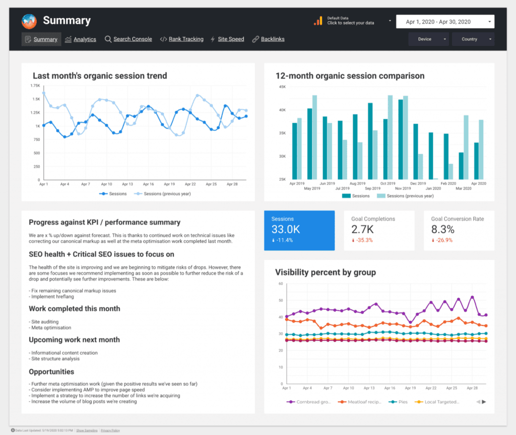
When I create a client dashboard, it often changes, depending on what the priorities are. But all my dashboards show the most important things, including:
Performance + a write-up explaining the top SEO KPIs.
What I’ve been working on over the past month.
Recommendations for the future.
I recently wrote the Ultimate Guide to SEO Reporting, which included a free Data Studio template that is ideal for your SEO reporting dashboard:
But I also wanted to give an overview of key things to consider when it comes to creating a dashboard for clients.
I'll look at what to include to create a foolproof SEO dashboard and some tips to make it client-friendly.
Goals, Transactions, and Revenue
This is an opportunity to show the ROI to your client. Drastically improving traffic is great, but if this isn’t leading to conversions, your client might question your fees.
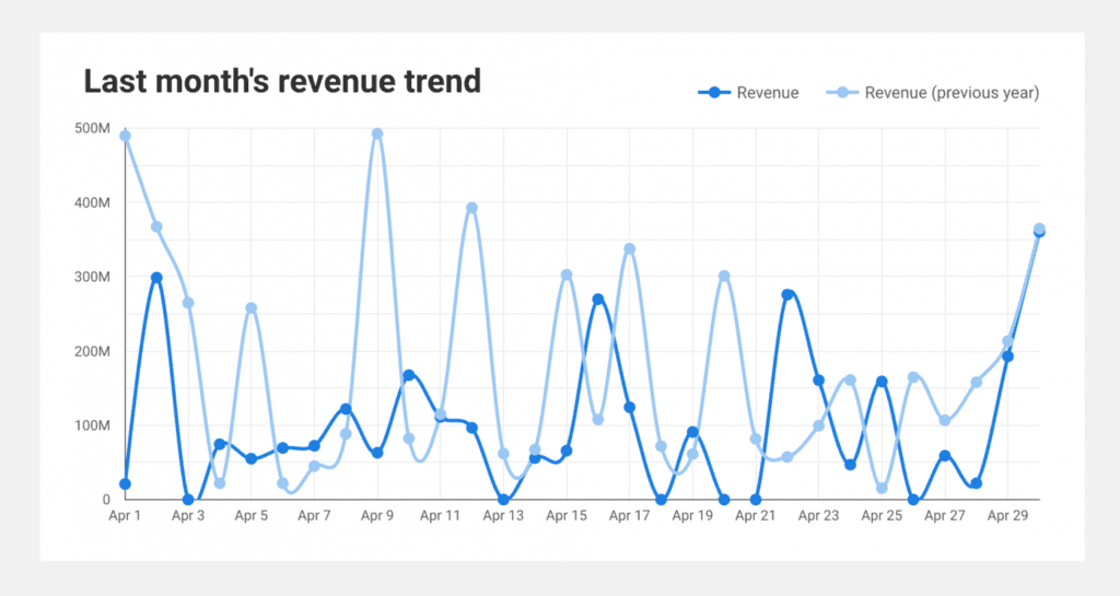
I always like to make this a focal point when I’m having our catchup call because this is what they ultimately care about. If your client can see that you’re continuously making them money, which they're investing if you for, they’ll continue to work with you.
Organic Traffic Summary
This chart is another great area for you to highlight how your efforts have impacted the client. Because of that, I suggest you include this at the beginning of your dashboard. Ideally, you should include a comparison with the previous year.
Here is what this could look like in your dashboard:
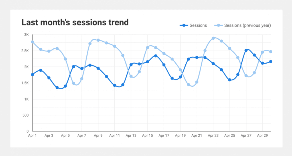
You want to show the data, so be sure to include bounce rate and other key engagement metrics in your report.
In the template, I’ve put together a simple scorecard that compares year-over-year results:
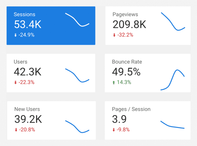
Your client might not be familiar with the SEO performance metrics above, so be sure to summarize not only what they mean, but specifically what they mean for their business.
Traffic Channel Overview
While this isn’t necessarily SEO, you want to include an overview of all your client’s traffic channels so your client can see which is providing the most traffic to their website, especially if you work on growing traffic via multiple channels.
In turn, this should direct you where to focus your time and money. Plus, it will show how the organic traffic grows compared to other channels.
I’d recommend including a chart like below, which includes a top-level session trend chart and then a 100% stacked bar chart to showcase the percentage differences each channel contributed each month:
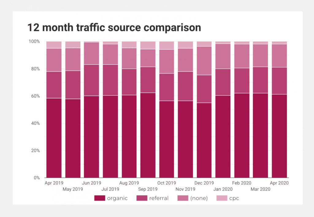
This helps you lead with the progress that you’ve made across these channels, but you will also want to explain why you believe this is working.
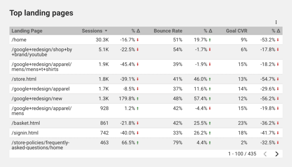
Organic Landing Pages
It's interesting and beneficial to know how visitors are finding the website, but what's really helpful is to know is why they came to the website. What did they come to view? What pieces of content caused them to click from a SERP, and what did they engage with?
This simple dashboard will allow clients to quickly see what pages are working best and hopefully see that some of the pages you’ve been optimizing are seeing increases and converting (driving more revenue for them).
The image below gives you an idea of what to show; nothing advanced, but certainly useful for a client.
Keyword Performance
Most SEO strategies include keywords for you to target, so be sure to include their status in your dashboard.
Some key things to consider including in this section are:
Keywords the website is ranking for.
The position of these rankings.
Which keywords visitors are using to find the website.
A comparison of the rankings' competitor analysis.
The Advanced Web Ranking Data Studio connector is a really handy tool that allows you to automatically pull together reports that include how the website is performing against the target keywords and also how this looks within the wider market.
Here are a couple of examples of charts you could include.
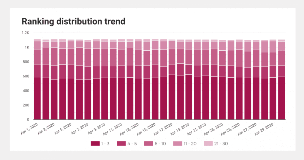
Ranking Distribution Trends
Ranking distribution charts are ideal for quickly highlighting rank changes from a top-level view.
If I want to see if there are any significant ranking changes, this is the first place I look.
When talking to a client about this chart, I’d usually talk about the number of keywords we’re seeing going into first-page positions.
If you’ve seen 20 keywords move into the top three positions in the past week, make sure to shout about it!
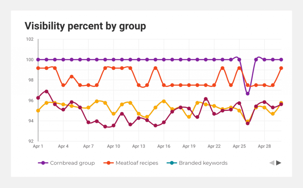
Visibility Comparisons
Visibility is another useful metric to show a top-level view of performance. What’s especially useful is when you break this down by different keyword groups.
When talking to a client about this, give them insights into the causes of the performance changes.
The client is going to care the most about commercial keywords, so I group these keywords and really focus discussions on how they’re performing.
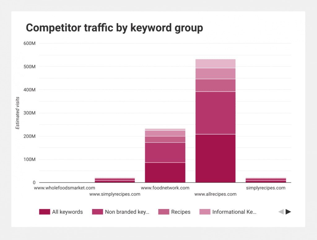
Competitor Insights
You’ll find in-house marketers keep a very keen eye on everything their competitors are doing. Therefore, make sure to keep the client up to date with how the SERP is changing.
One of the best benefits of using a rank tracker is getting daily updates on performance for your client's website, and their competitors.

One thing I also like to do is give clients insights into what keywords their competitors are performing well on relative to them.
Charts like the below can give you great insights into areas a competitor is focusing on as part of their SEO strategy that maybe you haven’t given enough weight to thus far.
Backlink Acquisition
Backlinks are integral to boosting rankings, but they aren’t always the easiest to attain, so you’ll want to highlight your efforts here.
Due to how time-intensive and therefore costly link building campaigns are, you’ll want to drive home to clients that you’re providing great value.
One way to do this is ongoing reporting on things such as:
Volume of backlinks gained over time
Quality of the backlinks
Backlink acquisition strategy
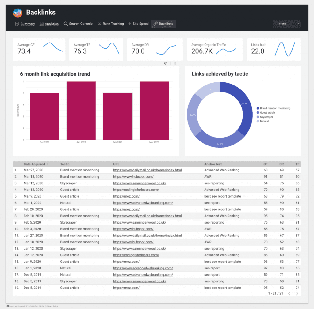
Many tools, such as Ahrefs, Majestic, and Moz, allow you to monitor the links a website has acquired.
I usually report mostly on ones that I’ve had a part in achieving, whether that’s from natural pickup from content created or via manual outreach.
Page Speed Insights
Page speed is a key part of providing a great user experience.
Google continues to reiterate the importance of page speed for SEO, so you’ll definitely want to include it in your client’s report.
Google's Page Speed Insights is a great, free tool to use. It provides an overview of a website's page speed and shows metrics for good, average, and bad website speeds. It also includes tips on how to fix any highlighted speed issues.
The Chrome User Experience Report (CrUX) is an automated reporting tool. The report contains real speed data reported by Chrome from users browsing the website, so you’ll want to hook this up to your dashboard to provide free insights on the experience users have on your client’s website
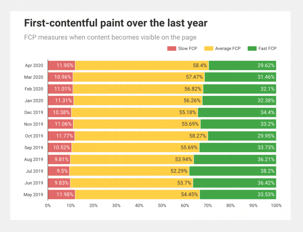
In addition to that, you can also use Wattspeed. It runs Lighthouse reports, stores them over time, and provides hourly uptime monitoring.
Also, here are some helpful resources for learning more about website speed:
30 tips to improve web speed - A filterable list of the top tips to improve website speed (created by me)
Web.dev - A resource created by Google on website speed, accessibility and more
WP Speed Matters - A website dedicated to educating users on improving website speed on WordPress.
Google Search Console
While Google Search Console is going to be handier for an SEO expert rather than a client looking for brief information, you could provide some top-level details on things such as impressions and clicks from top queries and where they rank.
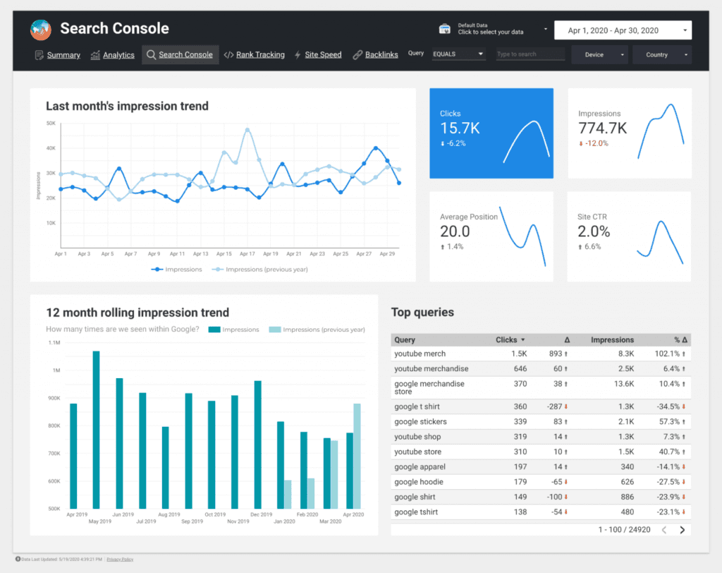
Impressions
When discussing impressions with clients, I usually use this as a conversation starter around both search demand and how visible the website is in search.
In a lot of cases, especially for new websites, I find impressions can go up massively before you start to really see that turn into traffic.
This can simply be due to beginning to rank on the first page. Use this to start conversations around that there are early signs of progress.
In other cases, a client may be high authority and consistently ranking on page one. This makes impressions great for measuring demand.
If I can’t see any significant ranking changes, I turn the conversation to talking more about how we’re seeing changes in demand by a certain percent, or certain keywords are being searched less year over year. If you want to double-check before you have this conversation, make sure to validate search volume on Google Trends or Search Demand Trends.
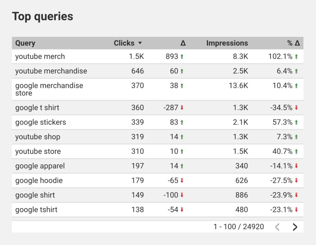
Queries
It’s also useful to give an overview of queries, to show what is driving a change in traffic. If the client has a high-priority keyword, with a high commercial intent, include that at the top of this report.
Time On Site and Bounce Rate
This is more of a “nice to have,” as it’s not essential to every client.
Time on site and bounce rate work together to give you a good indication of the quality and relevancy of content.
If you see a trend of someone clicking through just to immediately bounce, there could be issues in relevancy. Does the content align with what they’re expecting to see?
If time on site is low, this could be due to a number of reasons, such as poor design, low-quality content, low-quality images, etc.
This needs to be measured overtime on a page-by-page basis. A lot of blog content is consumed when people are just looking for an answer to a question - and therefore they tend to bounce, this isn’t necessarily an indication that the content is low quality.
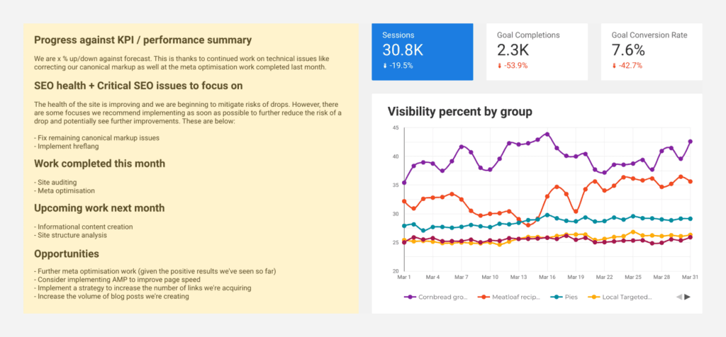
Future Opportunities and Recommendations
While your report will give your client an idea of what’s going on behind the scenes, you'll also want to include something actionable.
I recommend adding action items to the summary, so your client (and especially the people they report to) can quickly see what opportunities are available. This will reassure your client that you’re always thinking ahead as well as build a case within your agency to upsell the client.
Here is an example of the information I like to include monthly on the client dashboard to give them a good overview of progress, focuses, and opportunities:
Conclusion
Creating SEO reports for your client isn’t the most exciting task at hand, but an absolutely vital one nonetheless.
Look at this as a time to not only show off what you’ve accomplished, but also to present your strategy going forward.
While your strategy will be established at the beginning, it’s likely to, and should, change slightly month to month based on the results from your report.
It’s not always plain sailing, so be enthusiastic about taking on any challenges that the report has presented, and be proactive!
Have any tips of your own? Why not share them with your peers in the comments below?

